Using Money When You Can’t See It
 1. Bigger, brighter, bolder
Treasury’s Bureau of Engraving and Printing is the federal agency responsible for designing and printing paper money.
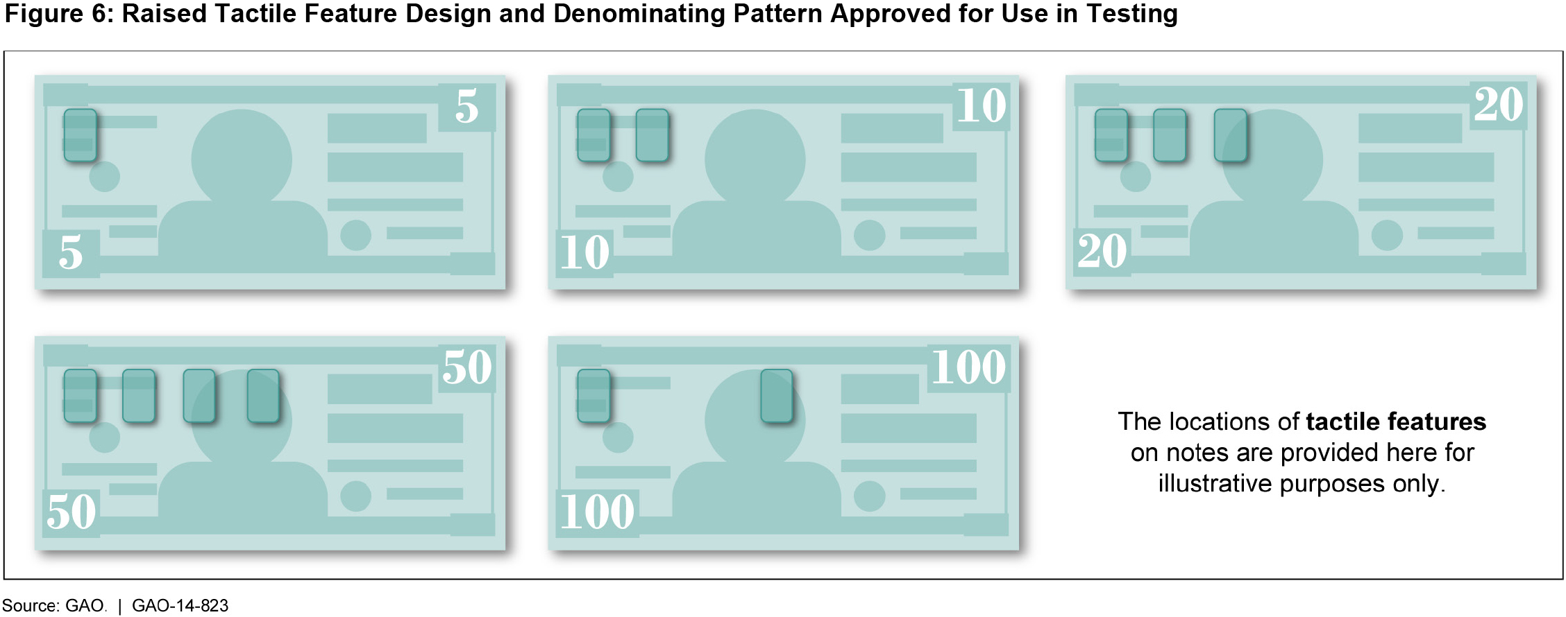
Starting in 1997, the Bureau added larger numbers to the back of paper currency (except for the $1 and $2 bills). The Bureau added even larger, colored numbers (referred to as "high contrast") to the $5 bill in 2008 and to the $100 bill in 2010.
While these new bills are an improvement, these numbers alone may not be enough to identify the denomination, depending on lighting conditions and the amount of useful vision a visually impaired person has.
2. Tell me about it
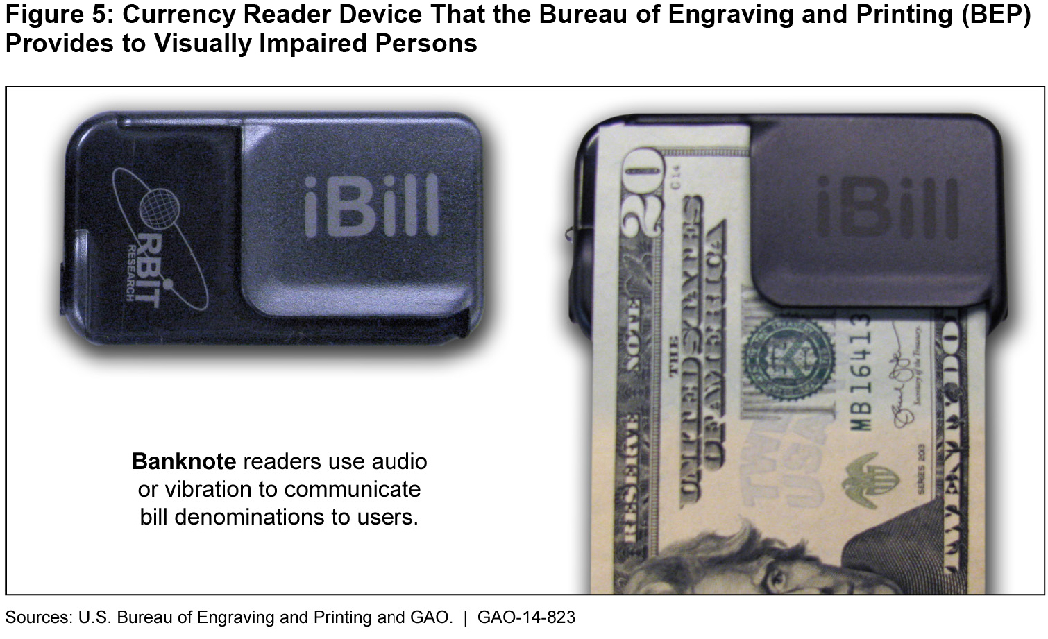
In July 2014, the Bureau began giving free currency-reader devices to eligible people. The reader, named the iBill, is a battery-operated device that can identify the denomination of a bill.
For example, the iBill can indicate a $20 bill by saying “twenty” through a speaker or an earpiece, emitting two high-pitched beeps, or vibrating for two long pulses. Or, for a $5 bill, it can say “five,” emit three low-pitched beeps, or vibrate for three short pulses.
1. Bigger, brighter, bolder
Treasury’s Bureau of Engraving and Printing is the federal agency responsible for designing and printing paper money.
Starting in 1997, the Bureau added larger numbers to the back of paper currency (except for the $1 and $2 bills). The Bureau added even larger, colored numbers (referred to as "high contrast") to the $5 bill in 2008 and to the $100 bill in 2010.
While these new bills are an improvement, these numbers alone may not be enough to identify the denomination, depending on lighting conditions and the amount of useful vision a visually impaired person has.
2. Tell me about it
In July 2014, the Bureau began giving free currency-reader devices to eligible people. The reader, named the iBill, is a battery-operated device that can identify the denomination of a bill.
For example, the iBill can indicate a $20 bill by saying “twenty” through a speaker or an earpiece, emitting two high-pitched beeps, or vibrating for two long pulses. Or, for a $5 bill, it can say “five,” emit three low-pitched beeps, or vibrate for three short pulses.
 (Excerpted from GAO-14-823)
 (Excerpted from GAO-14-823)
- Questions on the content of this post? Contact Lori Rectanus at rectanusl@gao.gov.
- Comments on GAO’s WatchBlog? Contact blog@gao.gov.

GAO's mission is to provide Congress with fact-based, nonpartisan information that can help improve federal government performance and ensure accountability for the benefit of the American people. GAO launched its WatchBlog in January, 2014, as part of its continuing effort to reach its audiences—Congress and the American people—where they are currently looking for information.
The blog format allows GAO to provide a little more context about its work than it can offer on its other social media platforms. Posts will tie GAO work to current events and the news; show how GAO’s work is affecting agencies or legislation; highlight reports, testimonies, and issue areas where GAO does work; and provide information about GAO itself, among other things.
Please send any feedback on GAO's WatchBlog to blog@gao.gov.